
Working with Postmarks
Quote from Steve on June 13, 2023, 12:15 pmI have been busy bettering my understanding of the CoGH HCD (Hooded Circular Datestamp) introduced in 1888. There were eight HCDs used at the Cape, nine if you include the larger GPO CAPE TOWN REGISTERED HCD.
My research resulted from Dr Simon Kelly's ground-breaking display on the subject. Simon asked questions which I believe can be answered with some reorganisation of all that is known and recorded. As a result, I have been trawling through my collection, displays, accumulation, reference books and begging examples from others in order to try and get a clearer idea of the postal working life of the HCD.
My research revolves around three main issues:
- Finding the ER (Earliest Recorded) and LR (Last Recorded) examples.
- Determining as far as possible the format used in the HCD when issued.
- Resolving issues of Town Name text size within the Hood in order to better identify 'varieties'.
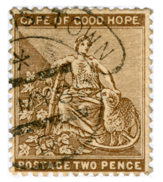
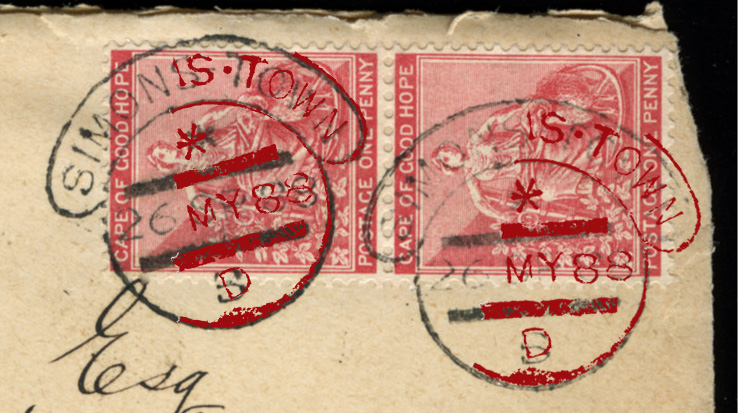
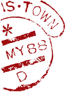
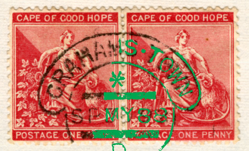
As part of my search for example HCDs, I found the stamp below dated 'May 88'. (It was in my sale stockbook!)
This is early. Just how early you can see from the sharpness of the postmark. It was made by a new datestamp!
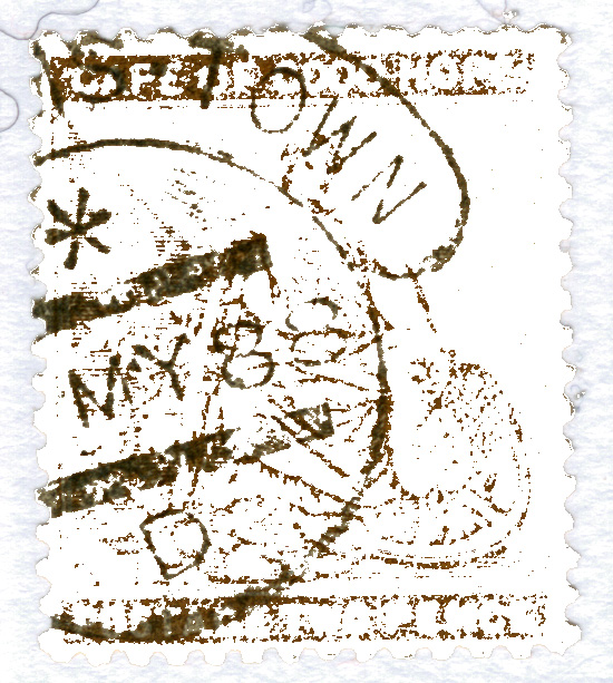
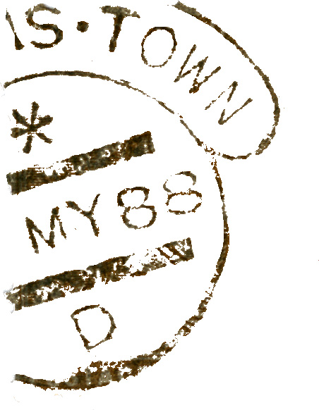
My research has allowed me to guess that the HCD was issued between 1st to 30th April, maybe even early May. Unfortunatley, on the stamp above the Day part of the date is missing, as is most of the Town Name. There are three HCD's that end 'S TOWN' - GRAHAMS TOWN, QUEENS TOWN and SIMONS TOWN. This is an attempt to show you how I concluded what the Town Name is.
Jumping ahead of myself here, GRAHAMS TOWN is separated by a raised dot while SIMONS TOWN uses a short hyphen that may morph into a dot depending on inking and use. As you can see from my stamp, the 'S' and 'TOWN' are separated by raised dot. Some might accept that as enough proof that it is Grahams Town's HCD but I need more evidence.
I believe that if I can extract the visible part of the postmark and superimpose it over the examples of early 1888 Grahams Town and Simons Town postmarks, we might achieve more certainty about its provenance.
1]. I scanned the stamp at 600 dpi. The higher defintion gives me more detail to work with.
2]. I used the Paint Bucket Tool drop White into most of the brown parts of the stamp ie. not the grey-black parts of the postmark.
I found that if I went too far I lost parts of the postmark. So, I stopped dropping White in at this point and....
3]. ..... began to use the Pencil Tool to tidy the image up in order to leave as much postmark detail as possible.
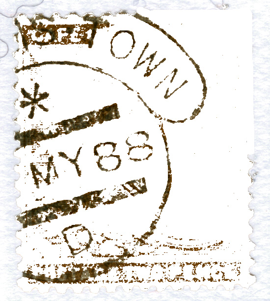
4]. I was left with a decent working postmark outline on a Whote background. I selected all the White areas with the Magic Wand and deleted it. (Unfortunately I can't show you the image on a transparent background here - but see later.)
6]. Because I need to superimpose this postmark over original examples, I painted this postmark red using the Paint Bucket Tool (Contiguous Off). This was slow work. There is probably an easier and quicker way to do it. Let me know if there is, please.
7]. Next, I reduced my Image Size to 300 dpi in order that it come in at the same and scale as the two 300 dpi images I was going to superimpose it over. This also made a smaller file.
8]. Once I had the remanant postmark outline at 300 dpi, I was able to Copy and Paste it in red at the same size and scale as the 300 dpi images of the Grahams Town stamp and Simons Town cover below.
You can see the results of two different attempts to get it to fit above. No amount of jiggery-pokery on the Simons Town cover found a matching fit. However, everything just fell into place with the Grahams Town stamp below, everything fitting beautifully.
The only real area of difference is in the asterisks. (One should expect the bottom Time Code Letter to be different.) My Grahams Town example of 'MY 88' uses a horizontal asterisk as opposed to the vertical one in '6 AU 88'. Asterisk orientation is something Simon Kelly first brought to my attention. I wonder how many other people have been aware of it before? I certainly was not.
So, there you have it. Proof of a new ER of 'MY 88' for Grahams Town. Or is it?????
Franco Frescura's 'Post Office and the Postal Markings of the Cape of Good Hope', (FREE to download and print out from the PFSA website), states that the ER for Queens Town is '13 MY 88'. On that basis it looks like my 'MY 88' stamp is possibly from Queens Town but I won't be able to confirm that until I've tested my postmark outline on an example from that town. The problem is that I have only one real copy of the postmark on stamp and cover AND they just do not match with my image which comes in about 50% bigger than it should. I have to scale it down to fit and I don't want to do that. I want to compare two like-sized images. I think this happenss because Kelly's image was once copied from the internet. Who knows? I need a few images to work with please.
Can anyone provide a 300 dpi scan of a Queenstown postmark that's not a drawn example found in a reference book? Please!
I have been busy bettering my understanding of the CoGH HCD (Hooded Circular Datestamp) introduced in 1888. There were eight HCDs used at the Cape, nine if you include the larger GPO CAPE TOWN REGISTERED HCD.
My research resulted from Dr Simon Kelly's ground-breaking display on the subject. Simon asked questions which I believe can be answered with some reorganisation of all that is known and recorded. As a result, I have been trawling through my collection, displays, accumulation, reference books and begging examples from others in order to try and get a clearer idea of the postal working life of the HCD.
My research revolves around three main issues:
- Finding the ER (Earliest Recorded) and LR (Last Recorded) examples.
- Determining as far as possible the format used in the HCD when issued.
- Resolving issues of Town Name text size within the Hood in order to better identify 'varieties'.
As part of my search for example HCDs, I found the stamp below dated 'May 88'. (It was in my sale stockbook!)
This is early. Just how early you can see from the sharpness of the postmark. It was made by a new datestamp!
My research has allowed me to guess that the HCD was issued between 1st to 30th April, maybe even early May. Unfortunatley, on the stamp above the Day part of the date is missing, as is most of the Town Name. There are three HCD's that end 'S TOWN' - GRAHAMS TOWN, QUEENS TOWN and SIMONS TOWN. This is an attempt to show you how I concluded what the Town Name is.
Jumping ahead of myself here, GRAHAMS TOWN is separated by a raised dot while SIMONS TOWN uses a short hyphen that may morph into a dot depending on inking and use. As you can see from my stamp, the 'S' and 'TOWN' are separated by raised dot. Some might accept that as enough proof that it is Grahams Town's HCD but I need more evidence.
I believe that if I can extract the visible part of the postmark and superimpose it over the examples of early 1888 Grahams Town and Simons Town postmarks, we might achieve more certainty about its provenance.
1]. I scanned the stamp at 600 dpi. The higher defintion gives me more detail to work with.
2]. I used the Paint Bucket Tool drop White into most of the brown parts of the stamp ie. not the grey-black parts of the postmark.
I found that if I went too far I lost parts of the postmark. So, I stopped dropping White in at this point and....
3]. ..... began to use the Pencil Tool to tidy the image up in order to leave as much postmark detail as possible.
4]. I was left with a decent working postmark outline on a Whote background. I selected all the White areas with the Magic Wand and deleted it. (Unfortunately I can't show you the image on a transparent background here - but see later.)
6]. Because I need to superimpose this postmark over original examples, I painted this postmark red using the Paint Bucket Tool (Contiguous Off). This was slow work. There is probably an easier and quicker way to do it. Let me know if there is, please.

7]. Next, I reduced my Image Size to 300 dpi in order that it come in at the same and scale as the two 300 dpi images I was going to superimpose it over. This also made a smaller file.
8]. Once I had the remanant postmark outline at 300 dpi, I was able to Copy and Paste it in red at the same size and scale as the 300 dpi images of the Grahams Town stamp and Simons Town cover below.
You can see the results of two different attempts to get it to fit above. No amount of jiggery-pokery on the Simons Town cover found a matching fit. However, everything just fell into place with the Grahams Town stamp below, everything fitting beautifully.
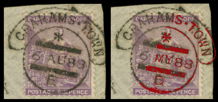
The only real area of difference is in the asterisks. (One should expect the bottom Time Code Letter to be different.) My Grahams Town example of 'MY 88' uses a horizontal asterisk as opposed to the vertical one in '6 AU 88'. Asterisk orientation is something Simon Kelly first brought to my attention. I wonder how many other people have been aware of it before? I certainly was not.
So, there you have it. Proof of a new ER of 'MY 88' for Grahams Town. Or is it?????
Franco Frescura's 'Post Office and the Postal Markings of the Cape of Good Hope', (FREE to download and print out from the PFSA website), states that the ER for Queens Town is '13 MY 88'. On that basis it looks like my 'MY 88' stamp is possibly from Queens Town but I won't be able to confirm that until I've tested my postmark outline on an example from that town. The problem is that I have only one real copy of the postmark on stamp and cover AND they just do not match with my image which comes in about 50% bigger than it should. I have to scale it down to fit and I don't want to do that. I want to compare two like-sized images. I think this happenss because Kelly's image was once copied from the internet. Who knows? I need a few images to work with please.
Can anyone provide a 300 dpi scan of a Queenstown postmark that's not a drawn example found in a reference book? Please!
Quote from Bas PAYNE on June 13, 2023, 7:53 pmCongratulations - the approach (trial by superimposition) is right, and your conclusions seems entirely reasonable. You don't need to worry about the orientation of the asterisk - this was almost certainly a moveable slug, and could have been taken out or fallen out and replaced rotated through 90 degrees, like a sideways letter, at any time.
I've been doing something similar by increasing contrast in magnified images of similar date-stamps, printing them out at matched size on OHT film, and superimposing them with a light behind, which is probably a bit quicker than your approach, but less clear. We really need a better software tool to achieve a better result more quickly and more automatically - a tool that allows us to select the colour range of the printed part of the stamp, and convert it to white; then to select the colour range of the date stamp and change it to a selected colour (e.g. black ink to red); then to do the same to a second date-stamp, changing the colour range of the date-stamp to another selected colour (e.g. black ink to blue); and then to superimpose the two selected date-stamp images using selected landmarks and 50% transparency so that we can see where they match and where they don't. I've tried Paint and Adobe; I don't think Paint has the right functionality; Adobe may, but isn't easy for a beginner to use, and is very expensive. Is there anyone out there who is good at this kind of software and wants to help??
Congratulations - the approach (trial by superimposition) is right, and your conclusions seems entirely reasonable. You don't need to worry about the orientation of the asterisk - this was almost certainly a moveable slug, and could have been taken out or fallen out and replaced rotated through 90 degrees, like a sideways letter, at any time.
I've been doing something similar by increasing contrast in magnified images of similar date-stamps, printing them out at matched size on OHT film, and superimposing them with a light behind, which is probably a bit quicker than your approach, but less clear. We really need a better software tool to achieve a better result more quickly and more automatically - a tool that allows us to select the colour range of the printed part of the stamp, and convert it to white; then to select the colour range of the date stamp and change it to a selected colour (e.g. black ink to red); then to do the same to a second date-stamp, changing the colour range of the date-stamp to another selected colour (e.g. black ink to blue); and then to superimpose the two selected date-stamp images using selected landmarks and 50% transparency so that we can see where they match and where they don't. I've tried Paint and Adobe; I don't think Paint has the right functionality; Adobe may, but isn't easy for a beginner to use, and is very expensive. Is there anyone out there who is good at this kind of software and wants to help??
Quote from Steve on June 14, 2023, 11:22 amThanks for the encouragement. Glad to know you think it is Grahams Town. See my next Reply below this.
Regarding the asterisk, its position served no postal pupose whatsoever other than a]. provide an extra area of obliteration within what would otherwise be a large blank area and curiously, when removed and left blank, b]. indicated 'early' acceptance by the PO. However, postmarks showing no asterisk (ie. early) and a Time Code Letter leave me guessing at the meaning of this.
The asterisk is interesting because as you say it was 'movable'. My inital research - it is far from complete - shows that in the early years of its use the asterisk enjoyed relatively long runs in the same position, them suddenly changed. I have never had a post office datestamp in my hand and have only very limited knowledge as to how the HDC was configured for daily use but the changes in asterisk orientation ( a very minor and nerdy issue) suggests to me that this was not always the result of daily changes to the date slug but was more likely the result of more infrequent events, like, as you say, the slug falling out or the cleaning of the datestamp when it was dismantled into its component parts and reassembled with the asterisk in a minutely different orientation.
I guess the question is "what can we learn from its changing positions?" I have found myself beginning to look at the asterisk on fragmentary postmarks in the hope of it aiding the identification a partial town name within the continuity of a known period of use of a specific date format. I will, of course, have to see many more examples before I can establish a pattern and come to a useful conclusion.
Regarding your software requirements, I have learned to work within the range of my limitations and solutions. The most difficult thing for someone who wants to "play with their stamps", (a loathsome expression), is to travel out of your comfort zone to do research on what software is available. This is a minefield of competing claims that need to be tested before you make a purchasing decision. This all takes time. The better, more powerful professional software will not only costs more but will almost certainly come with a steep learning curve. Rather like all processed food that claims to be "delicious", the software products you will look at will claim to be, "easy to use", "intuitive" and "user-friendly", if not make all three claims in one sentence. I don't believe them. I am sorry to say it but software-wise this old dog is now slow at learning new tricks. I will stick with what I know. I can live with what I have achieved here. Nevertheless, it would be nice if someone out there reads this and says, skipping the "easy to use" spiel, "hey, I know just the program you old guys need!" There must be a programmer out their with skills and access to code that can do what Bas wants but will he accept payment in stamps? Probably not. So the money thing becomes an issue. At the end of the day, our hobby is in decline and software that can help old boys play with their postmarks is not going to make a programmer any better off when there are much more rewarding options.
Thanks for the encouragement. Glad to know you think it is Grahams Town. See my next Reply below this.
Regarding the asterisk, its position served no postal pupose whatsoever other than a]. provide an extra area of obliteration within what would otherwise be a large blank area and curiously, when removed and left blank, b]. indicated 'early' acceptance by the PO. However, postmarks showing no asterisk (ie. early) and a Time Code Letter leave me guessing at the meaning of this.
The asterisk is interesting because as you say it was 'movable'. My inital research - it is far from complete - shows that in the early years of its use the asterisk enjoyed relatively long runs in the same position, them suddenly changed. I have never had a post office datestamp in my hand and have only very limited knowledge as to how the HDC was configured for daily use but the changes in asterisk orientation ( a very minor and nerdy issue) suggests to me that this was not always the result of daily changes to the date slug but was more likely the result of more infrequent events, like, as you say, the slug falling out or the cleaning of the datestamp when it was dismantled into its component parts and reassembled with the asterisk in a minutely different orientation.
I guess the question is "what can we learn from its changing positions?" I have found myself beginning to look at the asterisk on fragmentary postmarks in the hope of it aiding the identification a partial town name within the continuity of a known period of use of a specific date format. I will, of course, have to see many more examples before I can establish a pattern and come to a useful conclusion.
Regarding your software requirements, I have learned to work within the range of my limitations and solutions. The most difficult thing for someone who wants to "play with their stamps", (a loathsome expression), is to travel out of your comfort zone to do research on what software is available. This is a minefield of competing claims that need to be tested before you make a purchasing decision. This all takes time. The better, more powerful professional software will not only costs more but will almost certainly come with a steep learning curve. Rather like all processed food that claims to be "delicious", the software products you will look at will claim to be, "easy to use", "intuitive" and "user-friendly", if not make all three claims in one sentence. I don't believe them. I am sorry to say it but software-wise this old dog is now slow at learning new tricks. I will stick with what I know. I can live with what I have achieved here. Nevertheless, it would be nice if someone out there reads this and says, skipping the "easy to use" spiel, "hey, I know just the program you old guys need!" There must be a programmer out their with skills and access to code that can do what Bas wants but will he accept payment in stamps? Probably not. So the money thing becomes an issue. At the end of the day, our hobby is in decline and software that can help old boys play with their postmarks is not going to make a programmer any better off when there are much more rewarding options.
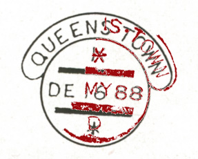
Quote from Steve on June 14, 2023, 11:51 amThe search to identify the missing Town Name goes on......
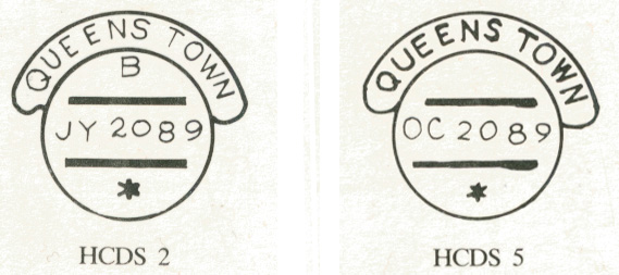
In the absence of actual examples of Queens Town HDC postmarks on stamps, I have drawn on the reference books of two distinguished South African postal historians, A. A. Jurgens RDPSA FRPSL and Robert Goldblatt RDPSA FRPSL. Together they provide three hand-drawn examples of the Queens Town HDC. I am hoping that these examples of the postmark will assist me in my quest to determine the town name on the partial postmark shown in red below.
Starting with Robert Goldblatt's very popular book, "The Postmarks of the CoGH", (Reijger Publishers, 1984, page 104), I have copied two hand-drawn images which will be familar to many. Neither show the dot that appears in the image.
You could say that the absence of a dot between 'S' and 'T' rules them out. However, hand-drawn images are hugely unreliable. In the belief that the artist forgot to include the dot and in the absence of better examples I have decided to use them to see if there is any chance that my red image will fit over them. Also, some will argue that the datestamp might have lost its dot by October 89.
As you can see, there appears to be no fit whatsover. Of note, the hood appears much wider in the superimposed red image. I wonder if this is a clue. Does the previously seen Grahams Town HCD have a wider hood?
Next we move on to A. A. Jurgens' image shown in "The Handstruck Letter Stamps of the Cogh". Jurgen's was often one for making big, bold statements unsupported by facts. Here he claims to show us how the HCD looked on its release. At least he has been able to supply an early 1888 image, (we hope), that includes a dot between 'QUEENS' and 'TOWN'. This looks promising. Or does it?
Sadly no. the result is as disappointing as the Goldblatt example.
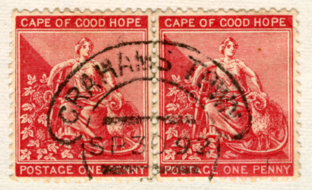
I worry about the accuracy of hand-drawn images used here. Additionally I was worried about the accuracy of my red outline although I know I was diligent in being as scrupulously accurate as possible. What bothers me most is the thickness of the hood. It seems to be a anomaly and an identifying feature of the Grahams Town HCD. As it made such a perfect fit on the previous post's Grahams Town example, I no longer have qualms about the issue. I am confident that I can now state that this the broader hood is an identifying feature of the Grahams Town HDC with dot of 1888. In this regards I have been aided in my argument by finding another good Grahams Town, albeit not one from 1888. As you can see, the fit is near perfect.
And here it is again, this time with my extracted postmark superimposed in green
CONCLUSION
I believe this is a new ER for Grahams Town! It is now over to the experts to decide.
The search to identify the missing Town Name goes on......
In the absence of actual examples of Queens Town HDC postmarks on stamps, I have drawn on the reference books of two distinguished South African postal historians, A. A. Jurgens RDPSA FRPSL and Robert Goldblatt RDPSA FRPSL. Together they provide three hand-drawn examples of the Queens Town HDC. I am hoping that these examples of the postmark will assist me in my quest to determine the town name on the partial postmark shown in red below.
Starting with Robert Goldblatt's very popular book, "The Postmarks of the CoGH", (Reijger Publishers, 1984, page 104), I have copied two hand-drawn images which will be familar to many. Neither show the dot that appears in the image.
You could say that the absence of a dot between 'S' and 'T' rules them out. However, hand-drawn images are hugely unreliable. In the belief that the artist forgot to include the dot and in the absence of better examples I have decided to use them to see if there is any chance that my red image will fit over them. Also, some will argue that the datestamp might have lost its dot by October 89.
As you can see, there appears to be no fit whatsover. Of note, the hood appears much wider in the superimposed red image. I wonder if this is a clue. Does the previously seen Grahams Town HCD have a wider hood?
Next we move on to A. A. Jurgens' image shown in "The Handstruck Letter Stamps of the Cogh". Jurgen's was often one for making big, bold statements unsupported by facts. Here he claims to show us how the HCD looked on its release. At least he has been able to supply an early 1888 image, (we hope), that includes a dot between 'QUEENS' and 'TOWN'. This looks promising. Or does it?
Sadly no. the result is as disappointing as the Goldblatt example.
I worry about the accuracy of hand-drawn images used here. Additionally I was worried about the accuracy of my red outline although I know I was diligent in being as scrupulously accurate as possible. What bothers me most is the thickness of the hood. It seems to be a anomaly and an identifying feature of the Grahams Town HCD. As it made such a perfect fit on the previous post's Grahams Town example, I no longer have qualms about the issue. I am confident that I can now state that this the broader hood is an identifying feature of the Grahams Town HDC with dot of 1888. In this regards I have been aided in my argument by finding another good Grahams Town, albeit not one from 1888. As you can see, the fit is near perfect.
And here it is again, this time with my extracted postmark superimposed in green
CONCLUSION
I believe this is a new ER for Grahams Town! It is now over to the experts to decide.
Quote from Bas PAYNE on June 14, 2023, 4:46 pmWith some hesitation - not my field ... I was interested to see that there may be potentially useful variation in the height of the hood between different date-stamps.
Measuring date-stamps is always a bit tricky because of the possibility of movement during the act of stamping, paper shrinkage, variation in inking, and accumulation of dried ink. Measurements are probably best taken from the middles of lines rather than from the edges , and should always be treated as approximate.
With this caution in mind, I've measured the diameters of the inner circles in the date-stamps considered in this thread, and the height of the hood, and then calculated the height of the hood as a percentage of the diameter of the inner circle (to avoid having to worry about variation in magnification in different images), with the following results:
Simons Town 26 SP 88 Hood Height 26.5% of Inner Circle Diameter
Grahams Town 6 AU 88 Hood Height 27.5-29.5% of Inner Circle Diameter (Hood Height smaller in the centre of the Hood)
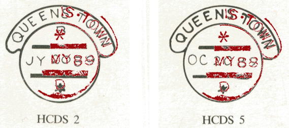
Queens Town JY 20 89 Hood Height 21.5% of Inner Circle Diameter (drawing)
Queens Town OC 20 89 Hood Height 23.5% of Inner Circle Diameter (drawing)
NS TOWN xx MY 88 Hood Height 29% of Inner Circle Diameter (measured towards side of Hood)
For what it's worth, this agrees well with the suggested identification of xx MY 88 as Grahams Town (as do other possible measurements).
With some hesitation - not my field ... I was interested to see that there may be potentially useful variation in the height of the hood between different date-stamps.
Measuring date-stamps is always a bit tricky because of the possibility of movement during the act of stamping, paper shrinkage, variation in inking, and accumulation of dried ink. Measurements are probably best taken from the middles of lines rather than from the edges , and should always be treated as approximate.
With this caution in mind, I've measured the diameters of the inner circles in the date-stamps considered in this thread, and the height of the hood, and then calculated the height of the hood as a percentage of the diameter of the inner circle (to avoid having to worry about variation in magnification in different images), with the following results:
Simons Town 26 SP 88 Hood Height 26.5% of Inner Circle Diameter
Grahams Town 6 AU 88 Hood Height 27.5-29.5% of Inner Circle Diameter (Hood Height smaller in the centre of the Hood)
Queens Town JY 20 89 Hood Height 21.5% of Inner Circle Diameter (drawing)
Queens Town OC 20 89 Hood Height 23.5% of Inner Circle Diameter (drawing)
NS TOWN xx MY 88 Hood Height 29% of Inner Circle Diameter (measured towards side of Hood)
For what it's worth, this agrees well with the suggested identification of xx MY 88 as Grahams Town (as do other possible measurements).
Quote from Steve on June 15, 2023, 11:08 amMany thanks for your measurements and your guarded agreement with my conclusion. As you say, your measurements tend to support my finding. This is encouraging and a valuable contribution to the discussion.
You describe the postmark in question as "NS TOWN xx MY 88". If we could see enough of the first letter to know that it was indeed an 'N', we could dismiss GRAHAMS TOWN as a source and concentrate on QUEENS TOWN or SIMONS TOWN as the only two possible options. However, the letter is only partial. We cannot see an 'N', just the right-hand side vertical pillar of a letter that must be either an 'N' or an 'M'.
Measurements
I am very pleased that you have introduced the subject of measurements as I now want to start a new Topic on 'Using Micrometers on Postmarks'. As I do not have one, this is an area that is totally new to me. I plan to buy one soon and am hoping that between you, Dave Osborne and others you might be able to advise me what features I should be looking for and also give some tips and techniques on how to use them. Your comments on problems arising from the act of stamping, ink and paper issues as well as measurements being best taken from the middles of lines rather than from the edges, is the sort of thing I am looking to learn from postal historians bold enough to have embraced new-fangled gizmos and gadgets.
Many thanks for your measurements and your guarded agreement with my conclusion. As you say, your measurements tend to support my finding. This is encouraging and a valuable contribution to the discussion.
You describe the postmark in question as "NS TOWN xx MY 88". If we could see enough of the first letter to know that it was indeed an 'N', we could dismiss GRAHAMS TOWN as a source and concentrate on QUEENS TOWN or SIMONS TOWN as the only two possible options. However, the letter is only partial. We cannot see an 'N', just the right-hand side vertical pillar of a letter that must be either an 'N' or an 'M'.
Measurements
I am very pleased that you have introduced the subject of measurements as I now want to start a new Topic on 'Using Micrometers on Postmarks'. As I do not have one, this is an area that is totally new to me. I plan to buy one soon and am hoping that between you, Dave Osborne and others you might be able to advise me what features I should be looking for and also give some tips and techniques on how to use them. Your comments on problems arising from the act of stamping, ink and paper issues as well as measurements being best taken from the middles of lines rather than from the edges, is the sort of thing I am looking to learn from postal historians bold enough to have embraced new-fangled gizmos and gadgets.
Quote from Steve on June 15, 2023, 12:34 pmI have just received an email from Prof. Alex Visser who maintains the on-line Postmark Addendum to Ralph Putzel's (and his) work. As part of this Alex updates Franco Frescura's original ER (Earliest Recorded) and LR (last Recorded) dates of use for CoGH postmarks. Alex has confirmed that 'xx MY 88' is Grahamstown. As such this is a new ER!
"Good Morning Steve,
I agree with your MAY 88 Grahamstown.
In my date listings if a part of the date is illegible we use "*", see also in Transvaal Philately listing of
postmarks by Bas and I. In cases like the HC where * is part of the design, it is quite evident what it is.Your matching the drawing is great for Grahamstown.
I fully agree with you that hand-drawn examples may not be the truth. That is why I try and replace the
images with the real McCoy.The two sizes in lettering for the HC is interesting. This is a field of study on its own.
Keep up the good work, and thanks for sharing.
Alex."
Okay! Done and Dusted!
I have just received an email from Prof. Alex Visser who maintains the on-line Postmark Addendum to Ralph Putzel's (and his) work. As part of this Alex updates Franco Frescura's original ER (Earliest Recorded) and LR (last Recorded) dates of use for CoGH postmarks. Alex has confirmed that 'xx MY 88' is Grahamstown. As such this is a new ER!
"Good Morning Steve,
I agree with your MAY 88 Grahamstown.
In my date listings if a part of the date is illegible we use "*", see also in Transvaal Philately listing of
postmarks by Bas and I. In cases like the HC where * is part of the design, it is quite evident what it is.
Your matching the drawing is great for Grahamstown.
I fully agree with you that hand-drawn examples may not be the truth. That is why I try and replace the
images with the real McCoy.
The two sizes in lettering for the HC is interesting. This is a field of study on its own.
Keep up the good work, and thanks for sharing.
Alex."
Okay! Done and Dusted!