
Using Photoshop Elements to the benefit of Postal History
Quote from Steve on September 17, 2020, 5:53 pmPHOTOSHOP ELEMENTS POSTMARK TUTORIAL 7/9
7]. Filling in the Circle
Using the highlighted circle as our base, we will now thicken it up and define the colour.Before we do this, we need to ensure that we are working on:
1]. the correct Layer - it must be highlighted in Blue - and
2]. have selected the correct Colour for the circle, typically the default black, (see COLOR, lower left).Go to Edit > Stroke (Outline) Selection. This command allows you to turn the highlighted circle into one of a defined thickness using the selected colour.
When you click on Stroke (Outline) Selection, the Stroke dialogue box appears. See below.
Set the line thickness to 15 px (pixels) and the colour to Black. Press OK to select this.
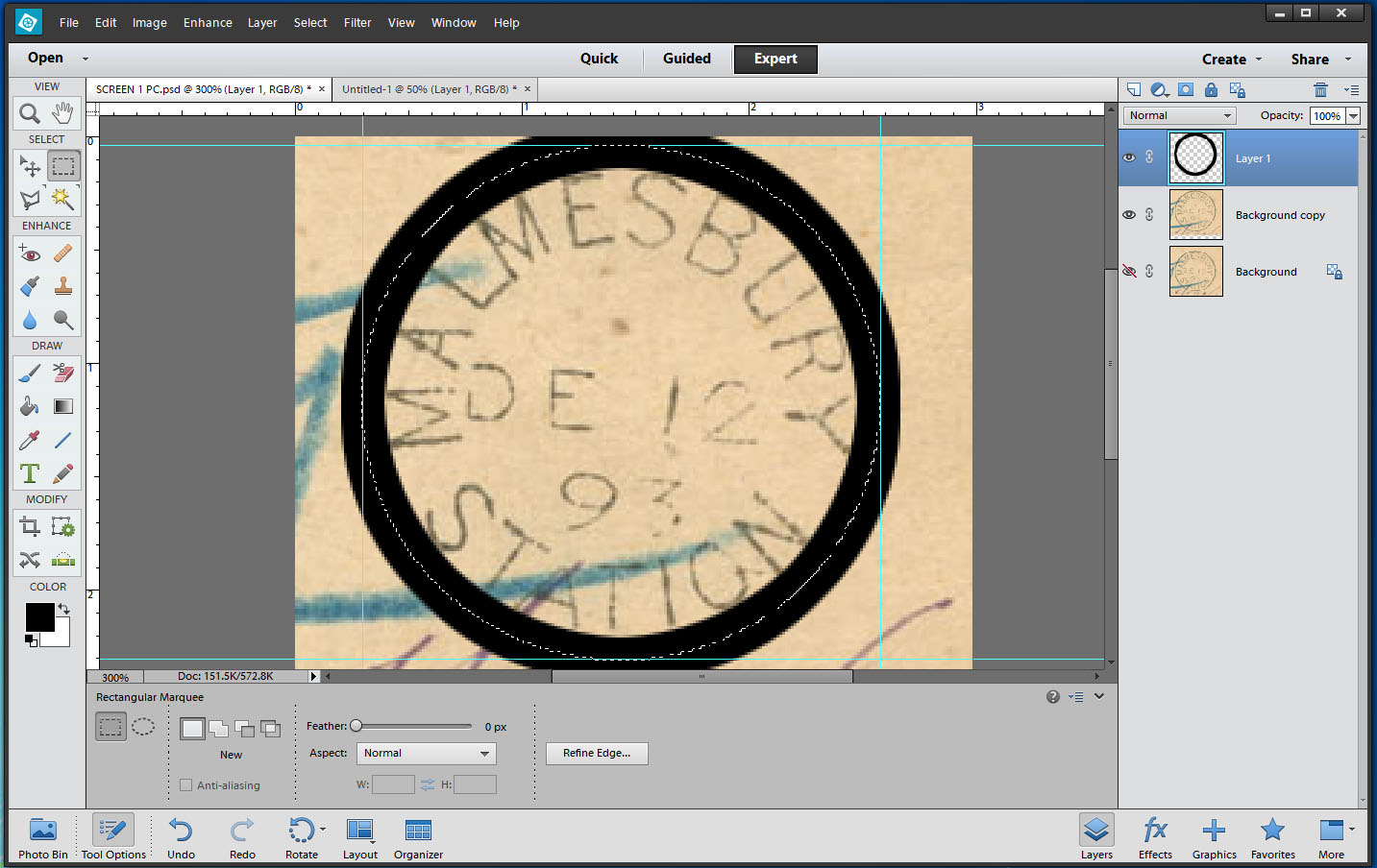
The highlighted circle is turned into a VERY THICK black circle 15 pixels wide. This does NOT match the scanned image.
The thickness of the circle needs to be adjusted. Select Edit > Undo Stroke.
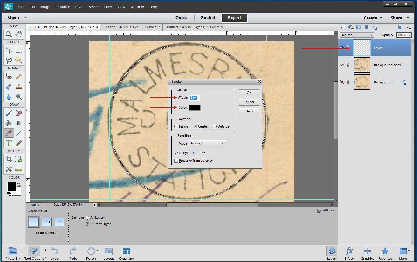
Click on Edit > Stroke (Outline) Selection. The Stroke dialogue box reappears.
(If nothing happens, check to see that you are not working on the Background layer. If it is highlighted in Blue, click inside Layer 1 to make it the active later and return to Select Edit > Undo Stroke.)
Set the default line thickness to 9 px (pixels). Press OK to select this.
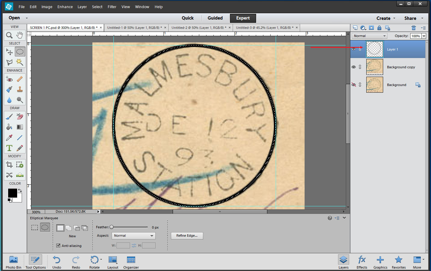
The result now matches the original thickness of the postmark. You can see, top right, that it is on its own layer.
PHOTOSHOP ELEMENTS POSTMARK TUTORIAL 7/9
7]. Filling in the Circle
Using the highlighted circle as our base, we will now thicken it up and define the colour.
Before we do this, we need to ensure that we are working on:
1]. the correct Layer - it must be highlighted in Blue - and
2]. have selected the correct Colour for the circle, typically the default black, (see COLOR, lower left).
Go to Edit > Stroke (Outline) Selection. This command allows you to turn the highlighted circle into one of a defined thickness using the selected colour.
When you click on Stroke (Outline) Selection, the Stroke dialogue box appears. See below.
Set the line thickness to 15 px (pixels) and the colour to Black. Press OK to select this.
The highlighted circle is turned into a VERY THICK black circle 15 pixels wide. This does NOT match the scanned image.
The thickness of the circle needs to be adjusted. Select Edit > Undo Stroke.
Click on Edit > Stroke (Outline) Selection. The Stroke dialogue box reappears.
(If nothing happens, check to see that you are not working on the Background layer. If it is highlighted in Blue, click inside Layer 1 to make it the active later and return to Select Edit > Undo Stroke.)
Set the default line thickness to 9 px (pixels). Press OK to select this.
The result now matches the original thickness of the postmark. You can see, top right, that it is on its own layer.
Uploaded files: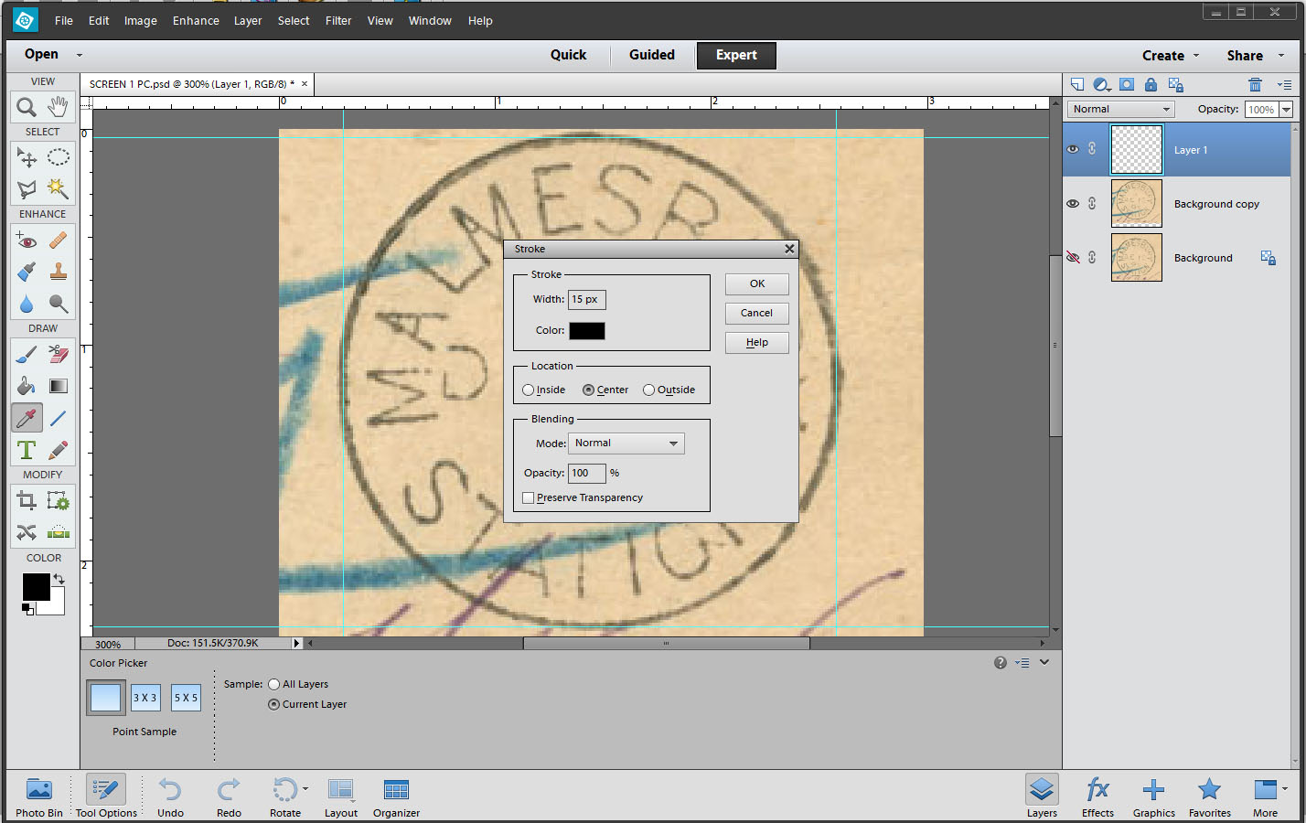
Quote from yannisl on September 18, 2020, 7:04 amSteve
Thanks for your tutorial. I am fairly good with computers and will see if I can get a copy with my next scanner. I am in need of a better scanner but postponing buying one, as we will be moving out of Qatar, either end of the year or early next year. So don't get surprised if sometime next year you see posts from me with "China World War II inflation" period covers!
In the meantime I will live with GIMP. Gimp's research appeared around 1995 and is still being developed and maintained. It is still going strong and many of the ideas and research on image manipulation are based on it.
For write-up I use TeX/LaTeX another open source program. GIMP and TeX have been the basis of the core of Adobe's products, which set the standards today with Photoshop and PDFs. Being open sourced they suffer from less polished user interfaces, but both can be programmed.
TeX/LaTeX is more difficult to use than Word or its derivatives, but with better results in my opinion. I would love to start a topic for "display write-up" typography to get feedback and comments, but I have been hesitant as might be off-topic for the website.
Steve
Thanks for your tutorial. I am fairly good with computers and will see if I can get a copy with my next scanner. I am in need of a better scanner but postponing buying one, as we will be moving out of Qatar, either end of the year or early next year. So don't get surprised if sometime next year you see posts from me with "China World War II inflation" period covers!
In the meantime I will live with GIMP. Gimp's research appeared around 1995 and is still being developed and maintained. It is still going strong and many of the ideas and research on image manipulation are based on it.
For write-up I use TeX/LaTeX another open source program. GIMP and TeX have been the basis of the core of Adobe's products, which set the standards today with Photoshop and PDFs. Being open sourced they suffer from less polished user interfaces, but both can be programmed.
TeX/LaTeX is more difficult to use than Word or its derivatives, but with better results in my opinion. I would love to start a topic for "display write-up" typography to get feedback and comments, but I have been hesitant as might be off-topic for the website.
Quote from Steve on September 18, 2020, 9:57 amPHOTOSHOP ELEMENTS POSTMARK TUTORIAL 8/9
8]. Creating Text
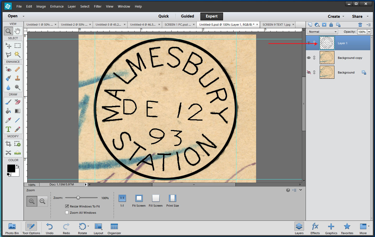
Using the Pencil Tool, we will now trace over the text in the scanned postmark.
Before we do this, we need to ensure (AGAIN) that we are working on:
1]. the correct Layer and
2]. have selected the correct Colour for the circle, typically the default black, (see COLOR, lower left).Click on the Pencil Tool. A broken cross with a square in the centre should appear.
Move this Pencil Tool cross to a part of the text that repesents the average text line thickness.
Press the [ bracket to reduce Pencil size.
Press the ] bracket to increase Pencil size.
Keep decreasing or increasing the Pencil size until it fills the width of your selected average text line thickness.
You can now drag the pencil tool over the text to trace it. It is best to work slowly in short sections of tracing. If you make a mistake you can use Edit > Undo to erase it and start that section agani. If you are working in short sections you will not erase all of your work, only the last, wrong part.
As the text of the Date appears to be thinner, reduce the average date line thickness by one or two increment using [.
Once you have completed tracing over the text, switch the Background copy layer off. Click on the Eye.
You can now examine your handiwork. This may have taken you some time to do. I have got this down to about half-an-hour per postmark, sometimes less. Practice will make you better at this.
PHOTOSHOP ELEMENTS POSTMARK TUTORIAL 8/9
8]. Creating Text
Using the Pencil Tool, we will now trace over the text in the scanned postmark.
Before we do this, we need to ensure (AGAIN) that we are working on:
1]. the correct Layer and
2]. have selected the correct Colour for the circle, typically the default black, (see COLOR, lower left).
Click on the Pencil Tool. A broken cross with a square in the centre should appear.
Move this Pencil Tool cross to a part of the text that repesents the average text line thickness.
Press the [ bracket to reduce Pencil size.
Press the ] bracket to increase Pencil size.
Keep decreasing or increasing the Pencil size until it fills the width of your selected average text line thickness.
You can now drag the pencil tool over the text to trace it. It is best to work slowly in short sections of tracing. If you make a mistake you can use Edit > Undo to erase it and start that section agani. If you are working in short sections you will not erase all of your work, only the last, wrong part.
As the text of the Date appears to be thinner, reduce the average date line thickness by one or two increment using [.
Once you have completed tracing over the text, switch the Background copy layer off. Click on the Eye.
You can now examine your handiwork. This may have taken you some time to do. I have got this down to about half-an-hour per postmark, sometimes less. Practice will make you better at this.
Uploaded files: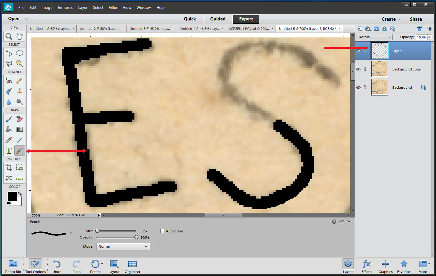
Quote from Steve on September 18, 2020, 1:15 pmPHOTOSHOP ELEMENTS POSTMARK TUTORIAL 9/9
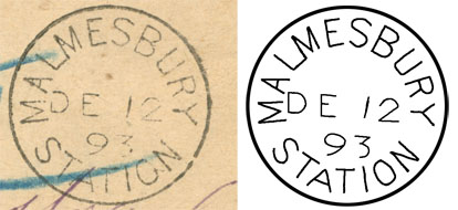
9]. The Ethics of Fine-tuning the Final Result.
There are issues with this result which I am unhappy with. There are parts I want to improve BUT....
One of my drawn S letters is better than the other. Assuming they are they same I would copy and rotate the better one to replace the poorer. However, if you examine the two S's, it would appear that one of them, perhaps the topmost S, has been inserted into the date slug upside-down.
If I was to copy the better S and turn it around to replace the other, the appearance would be improved BUT it will no longer be an accurate reflection of the original postmark. So, I will leave it as is.
Ditto the A's. The one is markedly wider than the other. They may be different types given their different widths. To replace one A with the other would be inappropriate. They must be left 'as is' if they are to reflect the original datestamp. So, again, I will leave it as is.
The O is awkward but it accurately follows what's there to trace over. Yes, I could tidy this up a bit.
THE RULE MUST BE "ONLY EVER REPRODUCE WHAT YOU CAN SEE"!
Never assume what the postmark you are working on should look like. If you working on a postmark that is largely or only partially complete, DO NOT attempt to create what you can't see or imagine should be there. If you do you may create something that never existed. The best solution is to find another example of the same postmark that shows the missing part of your original and then use that to complete the picture. Because of well-documented cases of artist's error, postal historians prefer to see real postmarks however poor rather than reproductions. Nevertheless, I and many others do like to embellish our displays with good, clear and accurate reproductions.
I hope this proves useful. If you have questions while attempting this, I am happy to advise you subject to workload.
PHOTOSHOP ELEMENTS POSTMARK TUTORIAL 9/9
9]. The Ethics of Fine-tuning the Final Result.
There are issues with this result which I am unhappy with. There are parts I want to improve BUT....
One of my drawn S letters is better than the other. Assuming they are they same I would copy and rotate the better one to replace the poorer. However, if you examine the two S's, it would appear that one of them, perhaps the topmost S, has been inserted into the date slug upside-down.
If I was to copy the better S and turn it around to replace the other, the appearance would be improved BUT it will no longer be an accurate reflection of the original postmark. So, I will leave it as is.
Ditto the A's. The one is markedly wider than the other. They may be different types given their different widths. To replace one A with the other would be inappropriate. They must be left 'as is' if they are to reflect the original datestamp. So, again, I will leave it as is.
The O is awkward but it accurately follows what's there to trace over. Yes, I could tidy this up a bit.
THE RULE MUST BE "ONLY EVER REPRODUCE WHAT YOU CAN SEE"!
Never assume what the postmark you are working on should look like. If you working on a postmark that is largely or only partially complete, DO NOT attempt to create what you can't see or imagine should be there. If you do you may create something that never existed. The best solution is to find another example of the same postmark that shows the missing part of your original and then use that to complete the picture. Because of well-documented cases of artist's error, postal historians prefer to see real postmarks however poor rather than reproductions. Nevertheless, I and many others do like to embellish our displays with good, clear and accurate reproductions.
I hope this proves useful. If you have questions while attempting this, I am happy to advise you subject to workload.
Quote from Steve on September 20, 2020, 12:03 pmYannis, I'm glad to hear you are "good with computers". That makes one of us who is.
I am lousy with computers, hence "The Tyranny of Technology". When I had my software business, I let others give the demos because I was often so uncertain around them that I feared if I went anywhere near them they would sense my negativity and crash. They often did. Having said that, I was great beta-software tester. I could get any piece of software tied up in knots by being utterly stupid with it and demanding the unexpected.
As I am not a programmer, I am not drawn to that side of shareware. For me, software is a tool to do a job, the quicker the better. Ease of use is the main consideration. Photoshop is not easy. It is quirky and you can really get your knickers in a twist if you do not know what you are doing. I fear that I have left much of what needs to be known out of the tutorial above. But we all have to start somewhere.
You say that "TeX/LaTeX is more difficult to use than Word or its derivatives, but with better results". I loathe Word. I have been using wordprocessor since 1980 and in my opinion Word is the worst of all of them. I went to nightschool in the local community college to learn to use it and came away after ten weeks of one hour a week sessions utterly unable to use it. But enough of that. I totally agree and encourage you to start "a topic for "display write-up" typography to get feedback and comments". I think that is an excellent idea.
IMO, display and technology is not at all off-topic. The Virus has changed philately. If our hobby is to continue, technology will be key to its survival. Already, Zoom meetings are demanding "PowerPoint demos only. No A4 display sheets". That is "The Tyranny of Technology" - all these old boys with years and years of pasted-up displays on A4 sheets now being subverted by Word, PowerPoint and Zoom. I want this website to reflect and understand the changing nature of philately and to be at the forefront of offering advice and encouragement to those of us who are confused by a world that is changing faster than anyone of us imagined fifty years ago.
Yannis, I'm glad to hear you are "good with computers". That makes one of us who is.
I am lousy with computers, hence "The Tyranny of Technology". When I had my software business, I let others give the demos because I was often so uncertain around them that I feared if I went anywhere near them they would sense my negativity and crash. They often did. Having said that, I was great beta-software tester. I could get any piece of software tied up in knots by being utterly stupid with it and demanding the unexpected.
As I am not a programmer, I am not drawn to that side of shareware. For me, software is a tool to do a job, the quicker the better. Ease of use is the main consideration. Photoshop is not easy. It is quirky and you can really get your knickers in a twist if you do not know what you are doing. I fear that I have left much of what needs to be known out of the tutorial above. But we all have to start somewhere.
You say that "TeX/LaTeX is more difficult to use than Word or its derivatives, but with better results". I loathe Word. I have been using wordprocessor since 1980 and in my opinion Word is the worst of all of them. I went to nightschool in the local community college to learn to use it and came away after ten weeks of one hour a week sessions utterly unable to use it. But enough of that. I totally agree and encourage you to start "a topic for "display write-up" typography to get feedback and comments". I think that is an excellent idea.
IMO, display and technology is not at all off-topic. The Virus has changed philately. If our hobby is to continue, technology will be key to its survival. Already, Zoom meetings are demanding "PowerPoint demos only. No A4 display sheets". That is "The Tyranny of Technology" - all these old boys with years and years of pasted-up displays on A4 sheets now being subverted by Word, PowerPoint and Zoom. I want this website to reflect and understand the changing nature of philately and to be at the forefront of offering advice and encouragement to those of us who are confused by a world that is changing faster than anyone of us imagined fifty years ago.
Quote from Jamie Smith on September 20, 2020, 1:37 pmSounds like 'Me & my A4's 'av 'ad it!
'Me
Sounds like 'Me & my A4's 'av 'ad it!
'Me
Quote from Steve on September 20, 2020, 6:58 pmJamie, I paint a bleak picture of the 'Tyranny of Technology' because it scares the living daylights out of me. BUT....
The future is not as bleak as I paint. We are all in the same lifeboat together here, adrift on stormy seas. I have one going on 2 displays of some 200 pages each and others in the pipeline. I have only one smaller PowerPoint display that needs updating. It is not going to happen anytime soon. I am still looking towards my A4 display sheets as the basis for for my future displays and questioning if I want to add a few A3s. Most philatelists and postal historians will not want to drop this format. Your A4 displays work very well on the SAPC site. A lot of people have commended you for them. (And wanted to buy some of your material!). I am not going to stop that side of the SAPC site simply because someone is suggesting PowerPoint is better for Zoom.
We will carry on carrying on doing what we do. But I do recognise that PowerPoint lends itself to some aspects of philately better than A4 sheets. If you are wanting to show a particular aspect of philately, like minor differences in line engraved stamps, minor varieties, double letters, re-entries, etc., these lend themselves well to enlarged images such as one can show using PowerPoint, etc. Often attendees at actual philatelic society meetings cannot see the varieties I refer to without the aid of a magnifying glass. Blowing these up and showing part of a stamp as a single PowerPoint frame is ideal in that regard. (Quite clearly, PowerPoint is not in the interests of many other philatelists whose interests lie elsewhere. But it is a tool that can be used to the benefit of our hobby.
We need to be wary of the disciples of the new, the tyrants of technology, who can use PowerPoint and Zoom and who propose that the rest of us should follow suit. No, no, no! Yes, things are changing. Yes, the world's re-arranging. The Covid-19 virus, self-isolation, on-line Zoom meetings, auctions and shops and the ability to view and discuss A4 display sheets on this SAPC and similar website have given philately a technical kick up the backside. We are not going to go back to the way things were. Things will change but in in many respects much of our hobby will stay the same.
Jamie, I paint a bleak picture of the 'Tyranny of Technology' because it scares the living daylights out of me. BUT....
The future is not as bleak as I paint. We are all in the same lifeboat together here, adrift on stormy seas. I have one going on 2 displays of some 200 pages each and others in the pipeline. I have only one smaller PowerPoint display that needs updating. It is not going to happen anytime soon. I am still looking towards my A4 display sheets as the basis for for my future displays and questioning if I want to add a few A3s. Most philatelists and postal historians will not want to drop this format. Your A4 displays work very well on the SAPC site. A lot of people have commended you for them. (And wanted to buy some of your material!). I am not going to stop that side of the SAPC site simply because someone is suggesting PowerPoint is better for Zoom.
We will carry on carrying on doing what we do. But I do recognise that PowerPoint lends itself to some aspects of philately better than A4 sheets. If you are wanting to show a particular aspect of philately, like minor differences in line engraved stamps, minor varieties, double letters, re-entries, etc., these lend themselves well to enlarged images such as one can show using PowerPoint, etc. Often attendees at actual philatelic society meetings cannot see the varieties I refer to without the aid of a magnifying glass. Blowing these up and showing part of a stamp as a single PowerPoint frame is ideal in that regard. (Quite clearly, PowerPoint is not in the interests of many other philatelists whose interests lie elsewhere. But it is a tool that can be used to the benefit of our hobby.
We need to be wary of the disciples of the new, the tyrants of technology, who can use PowerPoint and Zoom and who propose that the rest of us should follow suit. No, no, no! Yes, things are changing. Yes, the world's re-arranging. The Covid-19 virus, self-isolation, on-line Zoom meetings, auctions and shops and the ability to view and discuss A4 display sheets on this SAPC and similar website have given philately a technical kick up the backside. We are not going to go back to the way things were. Things will change but in in many respects much of our hobby will stay the same.
Quote from Bas PAYNE on March 25, 2023, 7:20 pmSteve:
Something I frequently want to do is to superimpose two postmarks to see whether they are the same or different. At the moment, I paste both onto a Word file, increase their size similarly, and the print them on film; then superimpose them and squint at the result. Not ideal. What I'd like to be able to do is to convert one image to one colour, convert the other to another colour, and superimpose them on-screen, so that if one image is blue and the other yellow, where they agree would be green, and where they differ would be yellow or blue .... And it needs to be reasonably easy and quick. Any suggestions?
Steve:
Something I frequently want to do is to superimpose two postmarks to see whether they are the same or different. At the moment, I paste both onto a Word file, increase their size similarly, and the print them on film; then superimpose them and squint at the result. Not ideal. What I'd like to be able to do is to convert one image to one colour, convert the other to another colour, and superimpose them on-screen, so that if one image is blue and the other yellow, where they agree would be green, and where they differ would be yellow or blue .... And it needs to be reasonably easy and quick. Any suggestions?
Quote from Steve on April 2, 2023, 11:33 amSorry, I missed this. You can do everything you want in Photoshop Elements except where you see a third colour. You would have to settle for having the two postmarks on separate layers (blue below, say, yellow on top) and seeing a bit of the blue underneath showing out behind the yellow. I imagine that what you want to do could be done in some program, possibly the full-blown PhotoShop (£19.97 pm). Off the top of my head I am unaware of any software that does this. The full-blown Photoshop has a very impressive list of feature. I suggest you contact Adobe or one of their dealers or better, a professional user. The other issue that I am sure you know all about is the vagaries of ink smudge and spread on paper that might exaggerate or minimise what you are comparing.
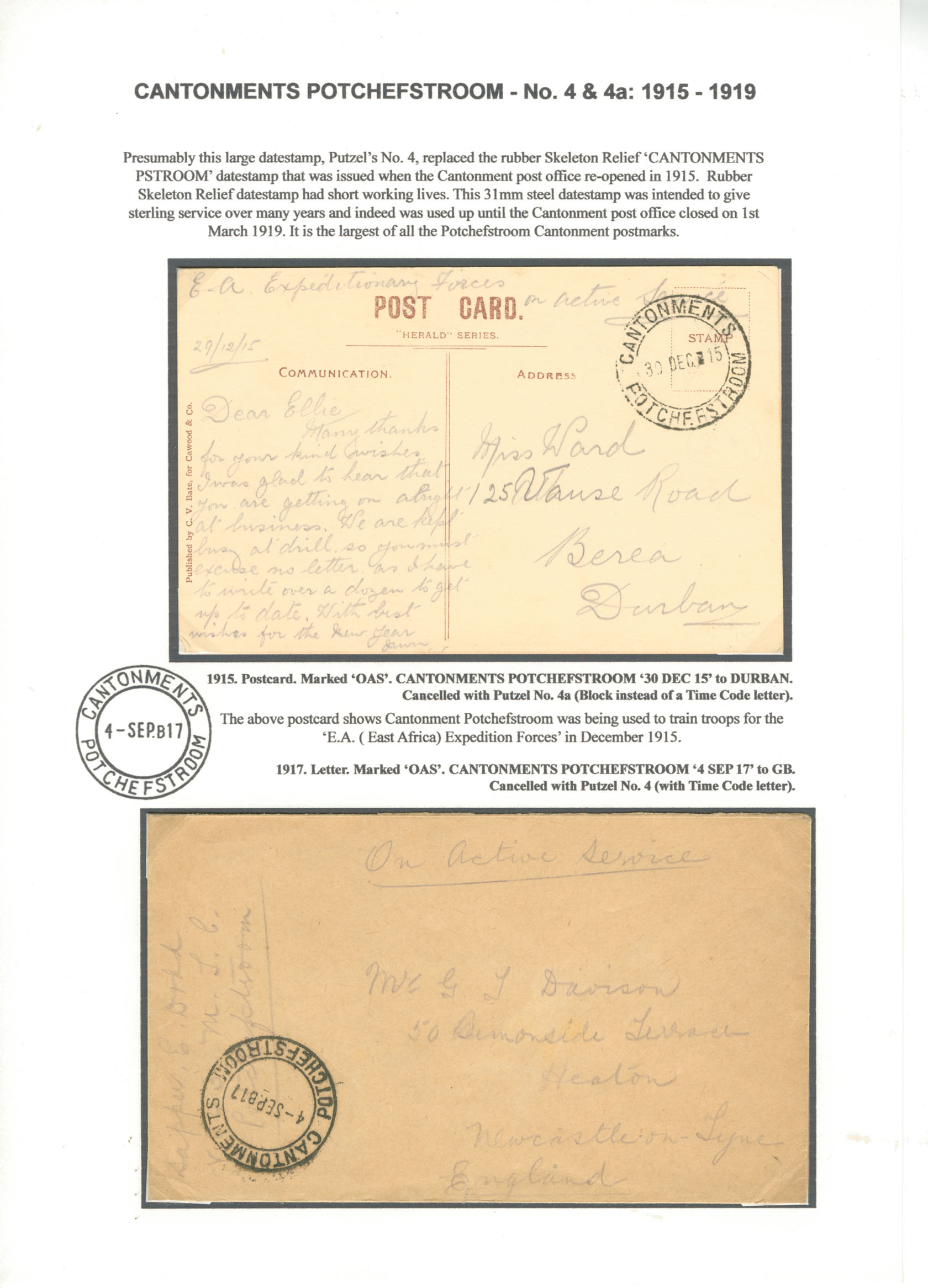
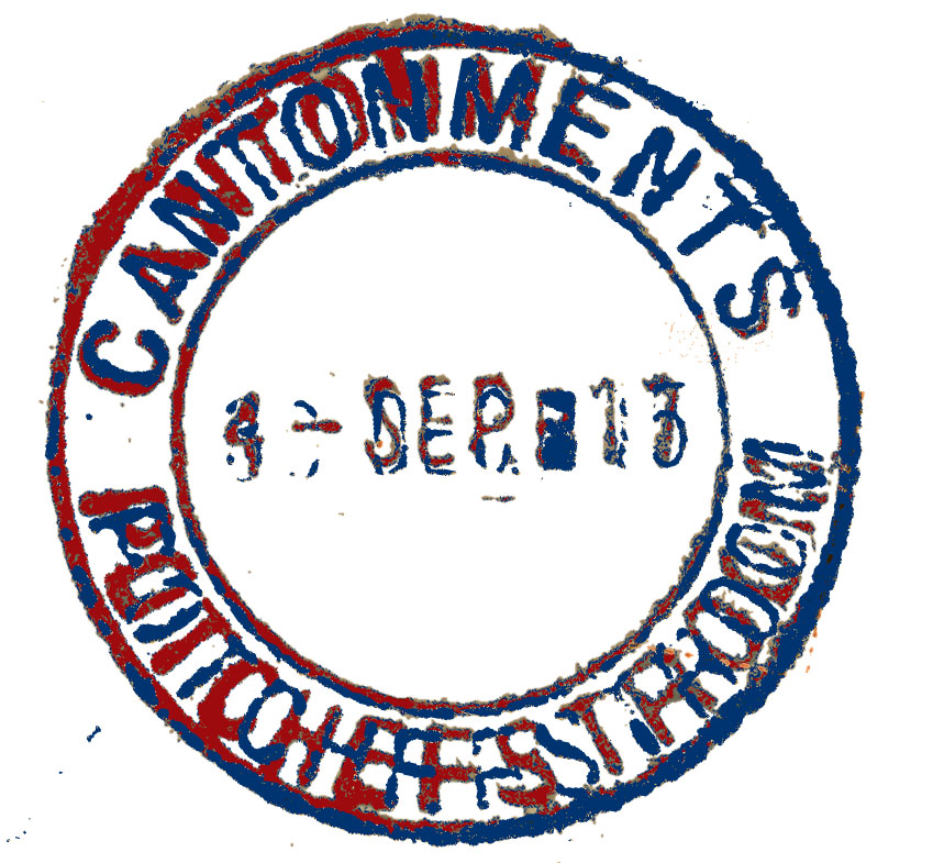
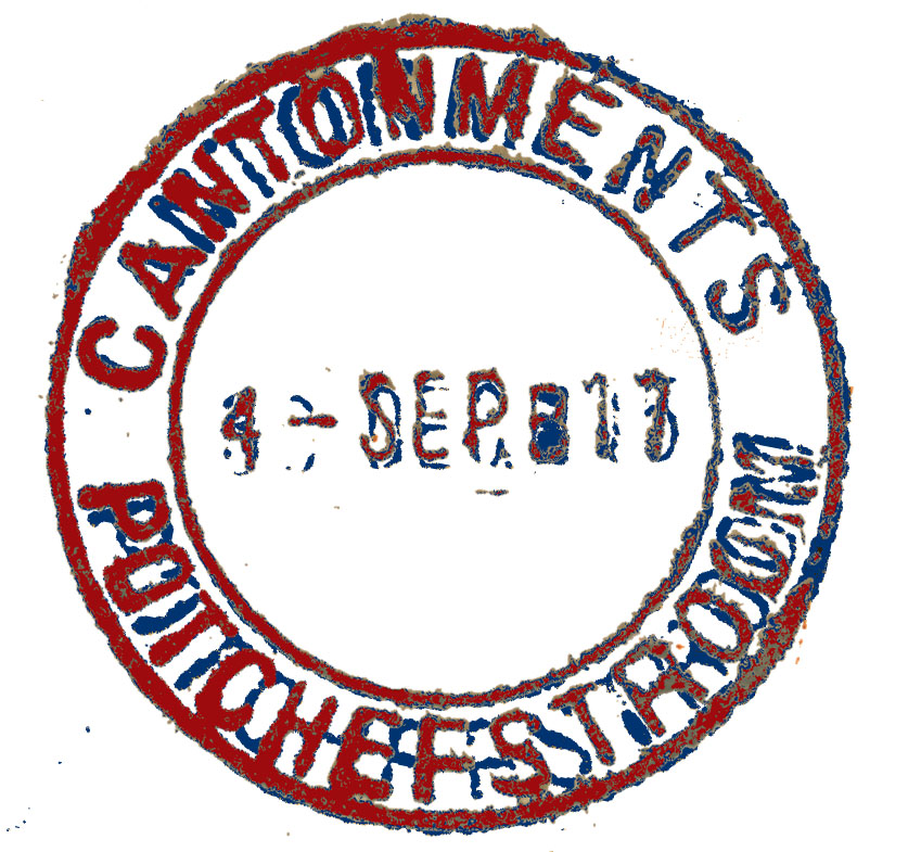
Thinking this was a challenge I took two similar but different Cantonment Potchesfstroom postmarks where in my opinion the only difference was the Block in No. 4a. I extracted the postmarks by scanning them at 600 dpi and reduced the two postmarks to red (yellow wasn't deep enough to see properly), and blue, then superimposed them over each other. You can see the results below. The process was fiddly and resulted in some profanity. A skilled Photoshopper should be able to do this easier and quicker. What surprised me was the discovery that the lettering was considerably if still only slightly different. (Perhaps this should have been no surprise as this is presumably human error?) Would I do this again? Yes under the circumstances that warranted it but in the main for most postmarks, no.
Images:
1]. Display sheet Cantonments Potchefstroon showing No. 4 and 4a.
2]. Blue superimposed over Red
3]. Red superimposed over Blue.
Sorry, I missed this. You can do everything you want in Photoshop Elements except where you see a third colour. You would have to settle for having the two postmarks on separate layers (blue below, say, yellow on top) and seeing a bit of the blue underneath showing out behind the yellow. I imagine that what you want to do could be done in some program, possibly the full-blown PhotoShop (£19.97 pm). Off the top of my head I am unaware of any software that does this. The full-blown Photoshop has a very impressive list of feature. I suggest you contact Adobe or one of their dealers or better, a professional user. The other issue that I am sure you know all about is the vagaries of ink smudge and spread on paper that might exaggerate or minimise what you are comparing.
Thinking this was a challenge I took two similar but different Cantonment Potchesfstroom postmarks where in my opinion the only difference was the Block in No. 4a. I extracted the postmarks by scanning them at 600 dpi and reduced the two postmarks to red (yellow wasn't deep enough to see properly), and blue, then superimposed them over each other. You can see the results below. The process was fiddly and resulted in some profanity. A skilled Photoshopper should be able to do this easier and quicker. What surprised me was the discovery that the lettering was considerably if still only slightly different. (Perhaps this should have been no surprise as this is presumably human error?) Would I do this again? Yes under the circumstances that warranted it but in the main for most postmarks, no.
Images:
1]. Display sheet Cantonments Potchefstroon showing No. 4 and 4a.
2]. Blue superimposed over Red
3]. Red superimposed over Blue.
Quote from yannisl on April 2, 2023, 1:27 pmI am very conversant with software (not adobe), but I gave up long ago trying to extract postmarks with a graphics program, Sometimes the old methods we were using, tracing paper, stencils and rotring pens were really quick. Possibly 2-4 minutes to a postmark. Granted I was good with technical drawing and had all the right tools. I wanted to trace some maps the other day, and I struggle with agraphics program. In the end, just stuck it on a glass window and traced it by hand. Comparing two postmarks by overlaying them on a transparency I would guess is still much quicker by an order of magnitude, although many printers these days, might not work with transparencies. I am not surprised at the differencs Steve found, these handstamps would get distorted with usage, manufacturing inaccuracies aside and even the paper on the envelope can shrink with time as they age. We dealing with material that is more than a century old.
I am very conversant with software (not adobe), but I gave up long ago trying to extract postmarks with a graphics program, Sometimes the old methods we were using, tracing paper, stencils and rotring pens were really quick. Possibly 2-4 minutes to a postmark. Granted I was good with technical drawing and had all the right tools. I wanted to trace some maps the other day, and I struggle with agraphics program. In the end, just stuck it on a glass window and traced it by hand. Comparing two postmarks by overlaying them on a transparency I would guess is still much quicker by an order of magnitude, although many printers these days, might not work with transparencies. I am not surprised at the differencs Steve found, these handstamps would get distorted with usage, manufacturing inaccuracies aside and even the paper on the envelope can shrink with time as they age. We dealing with material that is more than a century old.