Van Riebeeck Tercentenary 1952
Quote from Steve on March 20, 2022, 12:42 pmIt's coming up towards the 6th April again, so here goes....
A recent article by Tony Howgrave-Graham, (1952 Van Riebeeck Tercentenary - A Major Design Error. The Springbok, October 2021, Page 117), caused me to examine some of my stamps more closely, especially a control block of foxed 4½d deep blue showing, (as we now know), not van Riebeeck but someone else! To find out more you'll have to read the article. Do so by joining the SA Collectors' Society which will give you the option of a printed or on-line copy of The Springbok. For details email: steve@southafricanphilatelyclub.com
Tony refers to a "SAHB" as a reference for various flaws. Reading beteween the lines I am guessing that this is a Stanley Gibbons SA handbook, something I do not have. Neither my SACC 2008/2009 (South African Colour Catalogue) nor my Stanley Gibbons Commonwealth and British Empire 2009 Catalogue list any varieties for the 1952 Tercentenary issue. There is a reason for this. There are just too many to count.
The stamps were, I believed, printed by the Government Printers Pretoria. At the time of printing the new post-WW2 Afrikaner Nationalist government of Daniel François Malan, (1874 – 1959) was busy implementing Apartheid, a very large part of which was based on Affirmative Action (ie. discrimination for the upliftment of White workers). This meant placing relatively unskilled Whites in positions of authority over more experienced and deserving Black workers. I doubt that this was happening in the Government printers which had always been, I think, a closed shop to Black printing ambition. However, the cosy job security of nascent Apartheid's promise of work for life introduced a massive drop in quality standards and competence, none more so than in the 'slapgat' (Afr. slack-arsed) Government Printers Pretoria.
In truth, the Government printers had been a disgrace for some time. I hope to stand corrected but I doubt there is a single issue of South African stamps printed during the entire Union era that matches the quality of those printed by overseas printers. The Royal Visit of 1948 is an issue with arguably more flaws, listed or not, than any other. It has so many flaws and varieties that just like the Tercentenary issue it is hardly worth collecting. It is a travesty of the printer's trade. Perversely, my favourite Royal Visit stamp is the unlisted 'Royal Princesses with Acne', the inexcusable result of dust on film or plates. As a once photo-gravure printing apprentice, I know that dust is easily controlled by observing best practices. This Royal Visit issue is so bad one can only imagine the deliberate cause being rampant republican anti-British sentiment by the Government printers. It is inexcusably shoddy! Off with their heads!
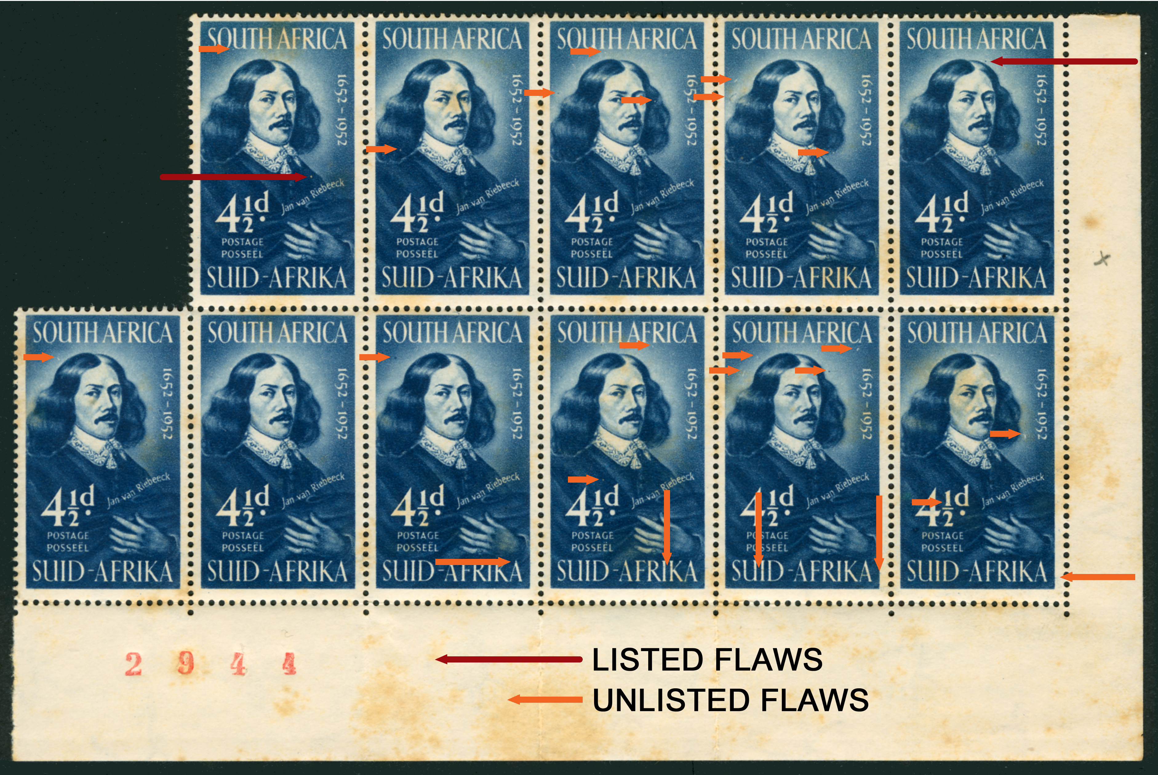
Anyway, coming back to Tony's comments on the 4½d deep blue printed from Cylinder 44, he says the SAHB 'list six minor varieties', two of which I have arrowed in red below. The six are:
1]. An oblique line or as he prefers to call this smudge a "feather in hair"plus a dot over his right eye. Row 1/7.
2]. A white dot in the 'A' of AFRIKA. Row 4/2.
3]. A mark by the head under 'F' of 'AFRICA'. Row 5/5. (See top right stamp in block below. Red arrow.).
4]. A white mark on the end of the hyphen. Row 3/13.
5]. A white dot on his shoulder above the value. Row 4/20. (See top left stamp in block below. Red arrow.)
NOTE: The white dot shown top left is NOT above the value. This is another one of many white dots!
6]. A blue spot between 'eck' and '52'. Row 5/13.In the '1' of the '4½d', most have a dot at the base of the '1'. The bottom right stamp has two dots.
Observe the bottom six stamps below from right. A gently rising line runs up and though the first four 'SUID AFRIKA's. It can be seen on each stamp entering from the bottom right.
With this and the Royal Visit issue, seek and ye shall find your flaw or variety! Sp, "are any of these flaws important enough to warrant being listed when clearly the entire issue is a mess?" and or "how do you determine whether one flaw is more worthy of listing than another?" The flipside of this is that perhaps the only collectible stamp in the block below is the one shown not to have any easily discernible flaws. See bottom second left. Now that is unusual!
None of these flaws will be a get rich quick discovery. At best, they exist merely to keep you entertained on cold winter nights, then lull you to sleep with the tedium of the predictable discovery of more. My example below is reduced in value because of its foxing. Even so, with flaws or not, the block is not worth much. I'd happily take £2 for it from a collector, plus the cost of postage just to clear my office a little! Any takers? Offer expires shortly!
It's coming up towards the 6th April again, so here goes....
A recent article by Tony Howgrave-Graham, (1952 Van Riebeeck Tercentenary - A Major Design Error. The Springbok, October 2021, Page 117), caused me to examine some of my stamps more closely, especially a control block of foxed 4½d deep blue showing, (as we now know), not van Riebeeck but someone else! To find out more you'll have to read the article. Do so by joining the SA Collectors' Society which will give you the option of a printed or on-line copy of The Springbok. For details email: steve@southafricanphilatelyclub.com
Tony refers to a "SAHB" as a reference for various flaws. Reading beteween the lines I am guessing that this is a Stanley Gibbons SA handbook, something I do not have. Neither my SACC 2008/2009 (South African Colour Catalogue) nor my Stanley Gibbons Commonwealth and British Empire 2009 Catalogue list any varieties for the 1952 Tercentenary issue. There is a reason for this. There are just too many to count.
The stamps were, I believed, printed by the Government Printers Pretoria. At the time of printing the new post-WW2 Afrikaner Nationalist government of Daniel François Malan, (1874 – 1959) was busy implementing Apartheid, a very large part of which was based on Affirmative Action (ie. discrimination for the upliftment of White workers). This meant placing relatively unskilled Whites in positions of authority over more experienced and deserving Black workers. I doubt that this was happening in the Government printers which had always been, I think, a closed shop to Black printing ambition. However, the cosy job security of nascent Apartheid's promise of work for life introduced a massive drop in quality standards and competence, none more so than in the 'slapgat' (Afr. slack-arsed) Government Printers Pretoria.
In truth, the Government printers had been a disgrace for some time. I hope to stand corrected but I doubt there is a single issue of South African stamps printed during the entire Union era that matches the quality of those printed by overseas printers. The Royal Visit of 1948 is an issue with arguably more flaws, listed or not, than any other. It has so many flaws and varieties that just like the Tercentenary issue it is hardly worth collecting. It is a travesty of the printer's trade. Perversely, my favourite Royal Visit stamp is the unlisted 'Royal Princesses with Acne', the inexcusable result of dust on film or plates. As a once photo-gravure printing apprentice, I know that dust is easily controlled by observing best practices. This Royal Visit issue is so bad one can only imagine the deliberate cause being rampant republican anti-British sentiment by the Government printers. It is inexcusably shoddy! Off with their heads!
Anyway, coming back to Tony's comments on the 4½d deep blue printed from Cylinder 44, he says the SAHB 'list six minor varieties', two of which I have arrowed in red below. The six are:
1]. An oblique line or as he prefers to call this smudge a "feather in hair"plus a dot over his right eye. Row 1/7.
2]. A white dot in the 'A' of AFRIKA. Row 4/2.
3]. A mark by the head under 'F' of 'AFRICA'. Row 5/5. (See top right stamp in block below. Red arrow.).
4]. A white mark on the end of the hyphen. Row 3/13.
5]. A white dot on his shoulder above the value. Row 4/20. (See top left stamp in block below. Red arrow.)
NOTE: The white dot shown top left is NOT above the value. This is another one of many white dots!
6]. A blue spot between 'eck' and '52'. Row 5/13.
In the '1' of the '4½d', most have a dot at the base of the '1'. The bottom right stamp has two dots.
Observe the bottom six stamps below from right. A gently rising line runs up and though the first four 'SUID AFRIKA's. It can be seen on each stamp entering from the bottom right.
With this and the Royal Visit issue, seek and ye shall find your flaw or variety! Sp, "are any of these flaws important enough to warrant being listed when clearly the entire issue is a mess?" and or "how do you determine whether one flaw is more worthy of listing than another?" The flipside of this is that perhaps the only collectible stamp in the block below is the one shown not to have any easily discernible flaws. See bottom second left. Now that is unusual!
None of these flaws will be a get rich quick discovery. At best, they exist merely to keep you entertained on cold winter nights, then lull you to sleep with the tedium of the predictable discovery of more. My example below is reduced in value because of its foxing. Even so, with flaws or not, the block is not worth much. I'd happily take £2 for it from a collector, plus the cost of postage just to clear my office a little! Any takers? Offer expires shortly!
Uploaded files: